In a competitive North American market, a binder's cover is more than a protective layer; it's a strategic asset. For small and medium-sized publishers, the right cover design, material choice, and finishing technique can differentiate an educational series, elevate a corporate manual, or signal premium quality for a specialty release. Moving beyond generic templates, publishers must use production capabilities to create covers that resonate with specific markets, from institutional buyers in the U.S. to trade channels across North America and Europe.
A well-executed binder cover acts as the first point of contact with your audience, immediately communicating the value and professionalism of the contents within. It must do more than simply look good; it must function as a core part of your brand strategy. To truly stand out, it's crucial to understand the principles behind how to design a cover that sells, ensuring your binder grabs attention immediately. This is particularly important for educational materials and professional training resources where perceived authority is key.
This roundup explores eight professional binder cover ideas, detailing the technical specifications, material choices, and integrated production solutions that transform a simple concept into a powerful market statement. Each idea is tailored for the modern publisher, focusing on how to align design with production efficiency, brand positioning, and supply chain strategy for maximum impact across both English and French markets. You will find actionable guidance on everything from eco-friendly stocks and premium foils to variable data printing, providing a clear path from concept to a finished product that reinforces your brand's standing.
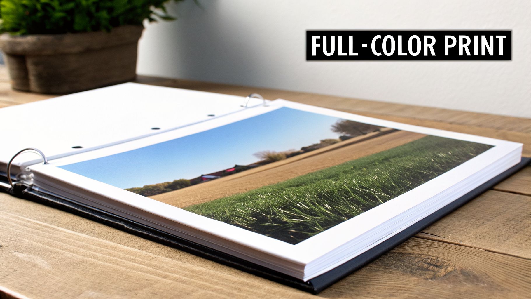
1. Custom Full-Colour Digital Print Covers
High-resolution digital printing offers a direct path for publishers to produce vibrant, full-colour binder covers with photographic precision. This method uses modern digital press technology to reproduce complex designs and detailed imagery without the setup costs associated with traditional offset printing. For publishers requiring professional-grade aesthetics across variable or smaller print runs, this approach provides a cost-effective and flexible solution.
Ideal Use-Cases
The strength of digital printing lies in its adaptability, making it a prime choice for projects where visual impact is critical, even at lower volumes. This technique is one of the most effective binder cover ideas for creating a strong market presence. Consider it for:
- Educational Materials: University presses can create visually engaging workbooks and course packs with custom branding for specific departments or programs. The ability to print on-demand aligns perfectly with fluctuating student enrolment numbers.
- Corporate Training Manuals: Companies can produce high-quality, branded training binders that reinforce corporate identity. Digital printing allows for easy updates to content and logos as the organization grows.
- Specialized Publishing: Publishers producing niche or specialty series can maintain a consistent, professional look across all titles while benefiting from the economic feasibility of smaller, targeted print runs.
Production and Technical Specifications
To achieve the best results, careful file preparation is essential. Collaborating with a print partner that has deep experience in digital production, such as Marquis, ensures that the final product matches the design intent.
Key Insight: The primary advantage of digital printing for binders is the elimination of plates and lengthy setup times. This makes it economically viable to test a cover design with a small batch before committing to a larger North American or European distribution.
File Preparation Checklist:
- Colour Space: Always submit design files in CMYK (Cyan, Magenta, Yellow, Key/Black). Files submitted in RGB must be converted, which can cause unexpected colour shifts.
- Bleed Margins: Incorporate a 0.25-inch (6.35 mm) bleed on all sides of the artwork. This ensures your design extends to the very edge of the cover after trimming, preventing any unsightly white borders.
- Resolution: For all images and graphics, use a minimum resolution of 300 DPI (dots per inch) to guarantee sharp, clear output.
- Protective Finishes: Request a matte or gloss coating to protect the print from scuffing and handling, extending the binder's lifespan. Matte finishes offer a subtle, sophisticated feel, while gloss makes colours pop.
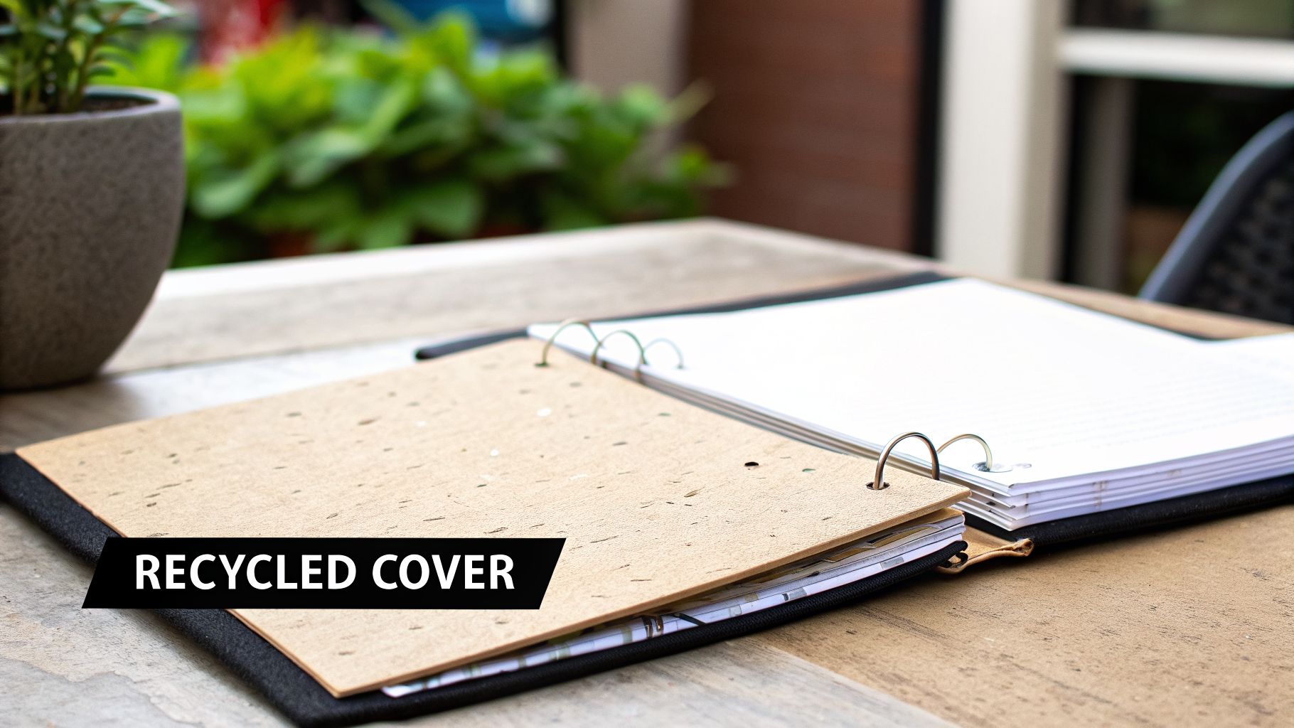
2. Eco-Friendly Recycled Paper Covers
Sustainable binder covers crafted from post-consumer recycled paper or FSC-certified materials are an excellent choice for publishers and educational institutions aiming to reduce their environmental impact. This approach visibly demonstrates corporate responsibility while delivering a professional, durable product that resonates with an eco-conscious audience. It's a binder cover idea that aligns brand values with tangible action.
Ideal Use-Cases
Recycled paper covers are particularly effective for projects where the publisher's message is tied to sustainability, education, or social responsibility. This choice reinforces the content's integrity and appeals to specific market segments. Consider it for:
- Corporate Sustainability Reports: Presenting an annual environmental or social governance report in a binder made from recycled materials sends a powerful, consistent message of commitment.
- University Press Materials: Course packs for environmental science, sociology, or public policy programs benefit from a cover that reflects the subject matter's core principles.
- Non-Profit and NGO Documents: Organizations focused on conservation, advocacy, and community outreach can use recycled binders for their training manuals, annual reports, and member kits to align with their mission.
- Environmental Science Textbooks: Publishers can underscore the educational content by choosing a production method that practices the principles taught within the book.
Production and Technical Specifications
Achieving a high-quality result with recycled materials requires attention to specific production details. Partnering with a printer knowledgeable in sustainable options ensures the final product is both beautiful and certifiably green. For an overview of material choices, explore Marquis's range of bindings, papers, and coatings.
Key Insight: Clearly displaying certification logos (like FSC or recycled symbols) on the binder's back cover or inside flap validates your environmental claims. This small detail adds significant credibility and informs the end-user of your commitment to responsible sourcing.
File Preparation Checklist:
- Ink Selection: Request vegetable-based or soy-based inks to complement the recycled paper and further minimize the product's environmental footprint.
- Colour Palette: Design with earth tones and natural colour schemes. These palettes work harmoniously with the subtle texture and unique character of recycled paper stock.
- Supplier Verification: Work with your print partner to source materials from certified suppliers to ensure all environmental claims are verifiable and authentic.
- Protective Finishes: Even eco-friendly binders need protection. Opt for a water-based aqueous coating for a protective layer that is more environmentally friendly than many traditional varnishes.
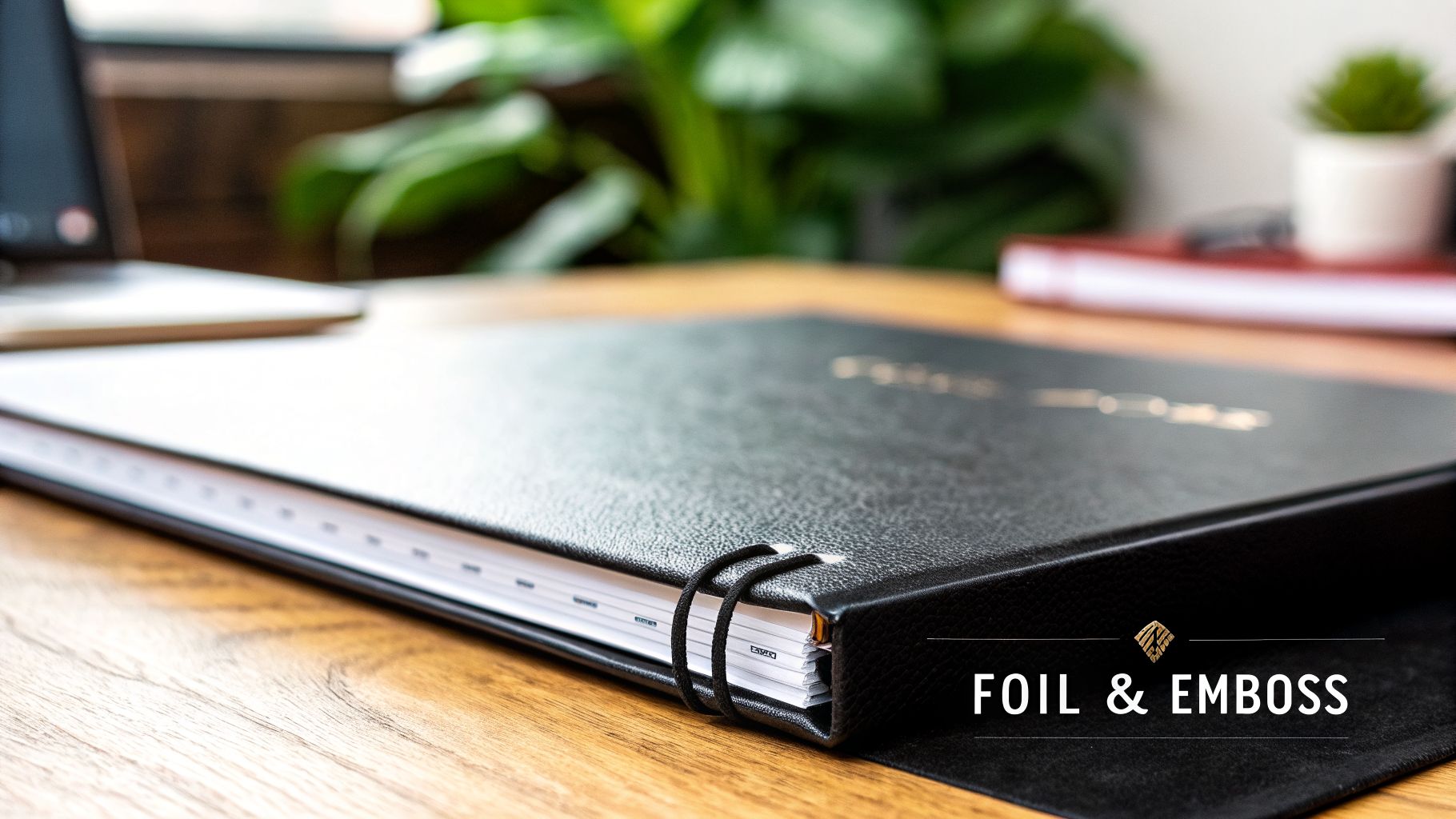
3. Foil-Stamped and Embossed Premium Covers
Combining foil stamping with embossing introduces a tactile dimension and visual elegance to binder covers. These finishing processes physically alter the cover's surface; foil stamping applies a metallic or pigmented foil using heat and pressure, while embossing creates a raised design. This pairing produces a premium look and feel that elevates a binder's perceived value, making it a powerful tool for publishers aiming to capture attention in high-value market segments.
Ideal Use-Cases
The luxurious effect of foil and embossing makes this one of the most distinguished binder cover ideas for projects where a sense of exclusivity and quality is paramount. It is an excellent choice for creating a lasting impression that resonates with discerning audiences. Consider it for:
- Premium Graphic Novel and Manga Editions: Publishers can create sought-after collector’s editions or deluxe versions of popular series, where the tactile cover justifies a higher price point.
- Limited Edition Luxury Collections: High-end trade and literary publishers use these finishes to signify a special release, often for classic works or author-signed collections that appeal to collectors.
- Corporate Executive Documents: Organizations can present annual reports, major proposals, or executive summaries in binders that project authority and meticulous attention to detail.
- High-End Trade Fiction: For a lead title or a breakout author, a foil-stamped cover can distinguish the book on crowded retail shelves and signal its importance to booksellers and readers.
Production and Technical Specifications
Success with foil and embossing requires precise design and close collaboration with a print partner. The physical nature of these processes demands that artwork is prepared with specific mechanical tolerances in mind to avoid errors.
Key Insight: The combination of foil and embossing adds both visual and physical weight to a design. This multi-sensory experience is highly effective for establishing a product as a premium offering, creating a memorable object that consumers are more likely to keep and display.
File Preparation Checklist:
- Vector Artwork for Dies: All foil and emboss elements must be submitted as vector files (e.g., .ai or .eps). This is non-negotiable, as physical dies are created from these files.
- Minimum Line Thickness: Ensure all lines and text to be foiled have a minimum width of 0.5 points. Thinner lines may not transfer cleanly, resulting in broken or incomplete foil application.
- Foil and Emboss Registration: If foil and emboss are applied to the same area (a "foil emboss"), provide a single vector file. If they are separate design elements, provide each on its own layer or in a separate file for accurate registration.
- Substrate Selection: Combine these finishes with premium, heavy-weight paper stocks and durable cover materials. The sturdiness of the substrate supports the die pressure and enhances the overall luxurious feel. For more information on what's possible, explore our full range of specialty finishes and embellishments.
4. Laminated Matte and Gloss Protective Finishes
Protective lamination is a finishing process that seals a printed binder cover with a thin, transparent film, offering significant durability and visual enhancement. This process protects the underlying print from moisture, scuffs, fingerprints, and general wear. Publishers can select between matte or gloss finishes, each providing distinct aesthetic and functional qualities to suit different market expectations and product positionings.
Ideal Use-Cases
Lamination is not just about protection; it is a strategic choice that communicates a product's intended quality and use. It stands as one of the most practical binder cover ideas for extending the life and appeal of frequently handled materials. Consider it for:
- Educational Publishing: Major publishers rely on lamination to ensure their workbooks and texts withstand a full academic year of use by students. A matte finish is often preferred for its glare-free readability.
- Medical and Pharmaceutical Documentation: In clinical or laboratory settings, binders must resist spills and constant handling. A gloss lamination provides a wipeable, non-porous surface that is easy to keep clean.
- Corporate and Institutional Training: Binders used for training materials benefit from the professional appearance and resilience of a matte lamination, which resists fingerprints during repeated use in professional environments.
- Trade Publishing: For consumer-facing trade books, a gloss finish can make cover colours appear more saturated and vibrant, helping the title stand out on a crowded retail shelf.
Production and Technical Specifications
The choice between matte and gloss is a critical decision that influences both perception and performance. Partnering with a print expert ensures the selected finish aligns with the paper stock and overall design goals for your project.
Key Insight: The tactile experience of a binder cover can be as important as its visual design. A soft-touch matte lamination conveys a premium, modern feel, while a high-gloss finish creates a perception of energy and high value, making it ideal for grabbing consumer attention.
File Preparation Checklist:
- Finish Selection: Choose matte lamination for a sophisticated, non-reflective surface ideal for professional or academic content. Opt for gloss lamination to make colours pop and create a high-impact visual for retail markets.
- Thickness Specification: Specify the lamination thickness, typically between 1.3 mil and 3.0 mil. Thicker films offer greater rigidity and protection, which is ideal for heavy-use binders.
- Colour Testing: Always request a finished sample proof. Lamination can slightly alter the appearance of printed colours, and testing ensures the final product meets your brand standards before a full production run.
- Combining with Other Finishes: For a luxury effect, consider pairing a matte lamination with a spot UV gloss or foil stamping to create a compelling contrast in texture and sheen.
5. Textured and Specialty Paper Stock Covers
Moving beyond standard gloss or matte finishes, printing on specialty papers with unique textures, finishes, and material compositions creates a distinctive tactile experience. Options like linen, felt, canvas, or classic kraft paper provide a binder cover with character and depth, signaling premium quality before the reader even opens the first page. This approach turns the cover into a sensory element that supports the book's overall theme and artistic positioning.
Ideal Use-Cases
The choice of a textured stock is a deliberate one, meant to connect with a specific audience or reflect the nature of the content. This is one of the most effective binder cover ideas for publishers aiming to create an artisanal or high-end product feel. Consider this method for:
- Literary and Art-Focused Publications: Mid-sized and specialty presses publishing poetry collections or literary fiction can use textured paper to give their titles a tangible, memorable quality that stands out on shelves.
- Boutique Publisher Releases: For limited-edition runs or special collections, a specialty stock reinforces exclusivity and justifies a premium price point, appealing to collectors and connoisseurs.
- Art and Coffee Table Books: A canvas or linen-textured cover can echo the artistic medium of the content within, creating a cohesive and immersive experience for the reader.
Production and Technical Specifications
Working with specialty papers requires close collaboration with your print partner to ensure the final product aligns with your creative vision. The paper's properties, including its absorbency, colour, and texture, directly influence how ink appears, making expert guidance essential.
Key Insight: Textured stocks do more than add visual appeal; they change how a reader physically interacts with a book. Requesting paper samples is not just a recommendation but a critical step to feel the weight and texture, ensuring it complements the design and content quality.
File Preparation Checklist:
- Colour and Proofing: Always request a hard-copy proof on the exact paper stock you intend to use. Colours can appear more subdued or shift on textured and non-white papers.
- Design Considerations: Pair the texture with a suitable design. A minimalist design with debossing or foil stamping often works better on heavily textured stock than a full-colour photograph.
- Paper Weight: Select a paper weight (measured in gsm or points) that feels substantial and durable. A thicker stock prevents curling and communicates the quality of the publication.
- Sourcing Time: Specialty papers may require longer lead times for sourcing. Factor this into your production schedule to avoid delays in your distribution timeline.
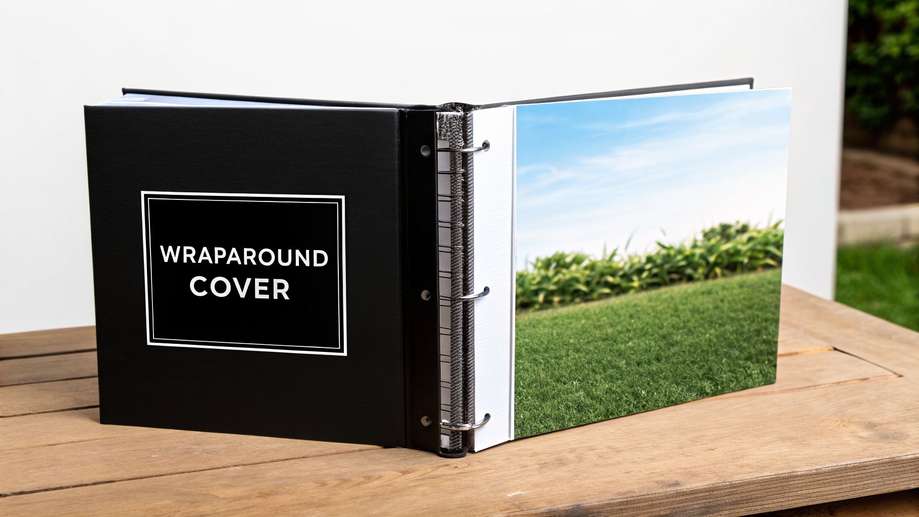
6. Wraparound and Full-Bleed Illustrated Designs
Wraparound covers, featuring illustrations that extend seamlessly across the front, spine, and back, create an immersive and continuous visual narrative. This approach maximizes the binder's entire surface area, transforming it into a single canvas for artistic expression. For publishers producing visually-driven content, this is one of the most effective binder cover ideas for establishing a cohesive and impactful design statement.
Ideal Use-Cases
The strength of a full-bleed wraparound design is its ability to tell a story before the binder is even opened. It is exceptionally well-suited for projects where the cover art is as important as the content inside. It is a popular choice for:
- Graphic Novels and Manga: Publishers frequently use this technique to present dynamic character art and key scenes that entice readers and create collectible editions.
- Children’s Picture Books: A continuous illustration across the entire binder can capture a child's imagination, depicting a playful scene or expansive world that invites them into the story.
- Art and Photography Collections: For limited edition catalogues or artist portfolios, a wraparound cover can feature a signature piece, giving the entire publication a premium, gallery-quality feel.
- Literary Box Sets: When packaging a series, a single panoramic illustration that spans multiple binder spines creates a stunning visual display on a bookshelf, encouraging readers to collect the entire set.
Production and Technical Specifications
Executing a flawless wraparound cover demands precision in both design and production. Close collaboration with your print partner is essential to manage the technical complexities and ensure the final product is seamless. Excellent graphic design and layout are critical to the success of these ambitious covers.
Key Insight: The most critical technical detail for a wraparound cover is the spine width calculation. An inaccurate measurement can cause the design to shift, misaligning key visual elements and disrupting the continuous artwork. Always confirm final spine dimensions with your printer based on the final page count and paper stock.
File Preparation Checklist:
- Unified Artwork: Submit the entire cover (front, back, and spine) as a single, continuous artboard. Do not provide separate files.
- Spine Gutter Awareness: Keep critical text and focal points of the illustration at least 0.25 inches (6.35 mm) away from the spine folds (gutters) to prevent distortion or awkward wrapping.
- Bleed Requirements: A 0.25-inch (6.35 mm) bleed must be added to all four outer edges of the flat cover layout to ensure the artwork extends to the edge after trimming.
- High-Resolution Imagery: Ensure all raster artwork maintains a minimum of 300 DPI at its final print size to avoid pixelation, especially on large-format illustrations.
- Request Mockups: Ask your print partner for a 3D digital or physical mockup to verify the alignment and placement of your design before committing to the full production run.
7. Interactive and Die-Cut Cover Elements
Die-cutting introduces a tactile and visual dimension to binder covers, creating an engaging experience that goes beyond a standard flat surface. This process uses a custom-made steel die to cut specific shapes, windows, or patterns into the cover material. The result is a memorable product that invites physical interaction, making the binder itself an object of interest and a statement of creative quality.
Ideal Use-Cases
The unique appeal of die-cutting makes it one of the most effective binder cover ideas for projects where grabbing attention and creating a premium feel is paramount. It is especially suited for niche markets and special editions where design plays a central role in value perception. Consider this technique for:
- Children’s Educational Binders: Shaped covers or peek-through windows can make learning materials more exciting for young readers, encouraging them to open the binder and explore the content.
- Holiday and Gift Sets: A binder with a festive die-cut, like a snowflake or tree, can serve as premium packaging for gift books or special course materials offered during the holidays.
- Limited Collector's Editions: For publishers releasing a collector's version of a work, a custom die-cut cover adds significant perceived value and justifies a higher price point.
- Premium Corporate Packages: High-end training binders or new-hire kits with a die-cut logo make a strong first impression and reinforce brand prestige.
Production and Technical Specifications
Successful die-cut projects depend on close collaboration between the design and production teams to ensure the final product is both beautiful and structurally sound. Working with an experienced print partner like Marquis from the initial concept phase is critical to navigating the technical requirements.
Key Insight: While die-cutting involves an initial tooling cost, this investment is justified by the distinct market advantage it creates. For publishers looking to produce a standout product, the cost is balanced by the potential for increased sales and brand recognition.
File Preparation Checklist:
- Die-Line File: Provide a separate vector file (e.g., from Adobe Illustrator) with the cut path clearly marked as a spot colour named "Die-Line." This tells the machinery exactly where to cut.
- Structural Integrity: Ensure there is enough material surrounding the die-cut areas to prevent tearing. A minimum of 0.25 inches (6.35 mm) of solid board around intricate cuts is recommended.
- Binding Compatibility: Confirm that the placement of your die-cut will not interfere with the binder's rings or spine mechanism.
- Stock Selection: Choose a durable, high-quality paper stock or board that can withstand the die-cutting process without fraying or weakening. Heavier stocks are generally preferred.
- Proofing: Always request a physical proof to test the die-cut's accuracy and the overall structural stability before committing to the full production run.
8. Variable Data and Personalized Custom Covers
Variable Data Printing (VDP) moves beyond one-size-fits-all production by allowing unique information on each binder cover within a single print run. This technology directly integrates database information into a design template, personalizing elements like names, identification numbers, or location-specific details. For institutional, corporate, and educational publishers, this offers an efficient way to create customized materials at scale without the setup costs of traditional methods.
Ideal Use-Cases
VDP is most effective when content needs to be specifically targeted to an individual recipient, department, or event. The ability to customize each unit adds a layer of professionalism and relevance that static covers cannot match, making it an excellent addition to any collection of binder cover ideas. Key applications include:
- Corporate Training Materials: Companies can print binders with each employee’s name, department, and training group, creating a personalized experience and simplifying distribution.
- University Course Packs: Educational publishers can produce materials customized with student names, course codes, or campus information, improving organization for large-scale programs.
- Personalized Professional Development: Workbooks for seminars or workshops can be tailored with attendee names and credentials, enhancing the value of the event.
- Institutional Documents: Administrative or financial reports can be printed with specific dates, department codes, or recipient details for precise record-keeping.
Production and Technical Specifications
Successful execution of a VDP project depends on meticulous data management and close collaboration with your print partner. Working with an experienced provider like Marquis ensures the technical aspects of data integration are handled correctly from the start.
Key Insight: The main benefit of VDP is mass customization. It allows for a high degree of personalization across a large print run, giving each recipient a unique product while maintaining brand consistency and production efficiency.
File and Data Preparation Checklist:
- Database Hygiene: Provide a clean, accurate database (e.g., .csv, .xlsx) with clearly labelled columns for all variable fields. Data validation is critical to avoid errors.
- Design File Markers: Use clear placeholders (e.g.,
<<FirstName>>,<<Department>>) in your design file to indicate where variable data should be inserted. - Proofing Process: Always request and review a set of proofs that demonstrates how the variable data will appear on the final product. Test the longest and shortest data entries to check for text flow issues.
- Colour Space: Submit design files in CMYK to prevent unexpected colour shifts during production.
- Safe Zones: Define ample safe zones around variable text fields to account for slight variations in text length and prevent content from being cut off.
- Protective Finishes: Apply a matte or gloss coating to safeguard the printed surface from handling and wear, ensuring the longevity of these high-value custom binders.
8-Way Binder Cover Comparison
| Item | Implementation complexity | Resource requirements | Expected outcomes | Ideal use cases | Key advantages |
|---|---|---|---|---|---|
| Custom Full-Color Digital Print Covers | Low–Moderate — digital press setup, color calibration | Digital press, CMYK files, short-run capacity, proofs | Photographic-quality full color, fast turnaround, variable options | Short-run trade, educational titles, specialized publishing | No large MOQs, rapid time-to-market, on-demand personalization |
| Eco-Friendly Recycled Paper Covers | Low — material sourcing and certification verification | Recycled/FSC stocks, vegetable inks, possible longer lead times | Natural textured appearance, reduced carbon footprint, muted color range | University presses, environmental textbooks, corporate sustainability reports | Demonstrates environmental responsibility, appeals to eco-conscious buyers |
| Foil-Stamped and Embossed Premium Covers | High — die setup, precise registration, finishing complexity | Foil dies, embossing equipment, premium substrates, longer lead times | Luxurious tactile finish, high perceived value, premium retail impact | Luxury editions, graphic novels, limited-run art books | Premium differentiation, shelf standout, supports price premium |
| Laminated Matte and Gloss Protective Finishes | Low–Moderate — added production step for lamination | Lamination equipment/coatings, adds cost and time | Durable, water-resistant covers; matte vs gloss aesthetic choices | Textbooks, institutional materials, trade paperbacks, children’s books | Extends lifespan, protects against wear, cost-effective durability |
| Textured and Specialty Paper Stock Covers | Moderate — sourcing, proofing for texture and color | Specialty stocks (linen, canvas, kraft), possible longer lead times | Distinct tactile feel, artisanal appearance, potential image softness | Art books, literary fiction, boutique and mid-sized publishers | Memorable tactile experience, strong brand/artist positioning |
| Wraparound and Full-Bleed Illustrated Designs | Moderate–High — precise spine calcs, complex file prep | Full-bleed printing, experienced design, tight QC for registration | Seamless cover imagery across front/spine/back, high visual impact | Graphic novels, children’s picture books, photography/art books | Maximizes design real estate, cohesive storytelling, high shelf appeal |
| Interactive and Die-Cut Cover Elements | Very High — custom dies, structural engineering, complex finishing | Custom die tooling, specialist finishing, higher setup cost and QC | Highly engaging tactile covers, unique silhouettes/windows, premium feel | Children’s books, gift/holiday books, limited collector editions | Strong differentiation, memorable unboxing, social-shareable designs |
| Variable Data and Personalized Custom Covers | Moderate — database prep, variable file setup and proofs | Digital variable printing workflow, data management, validation | Individualized covers at scale, consistent variation, faster fulfillment | Corporate training, university course materials, institutional bulk orders | Scalable personalization, eliminates multiple runs, increases engagement |
Integrating Cover Strategy with Your North American Print Partner
The diverse binder cover ideas explored in this article, from eco-friendly recycled papers to intricate foil-stamped designs, demonstrate a fundamental principle: a cover is far more than a protective layer. It is a critical component of your product's market identity and a direct reflection of your brand's commitment to quality. The most effective concepts are born not from isolated design sessions but from a strategic, collaborative process that aligns creative vision with production reality. Mastering this alignment is what separates a standard binder from a memorable, high-value asset.
Success hinges on moving beyond a simple transactional relationship with a supplier. A true manufacturing partner offers guidance that connects your design aspirations with tangible outcomes. They can advise on how a particular textured stock will interact with a full-bleed illustration or whether a die-cut element is feasible within your project's budget and timeline. This integrated approach ensures your final product is not only visually compelling but also structurally sound and cost-effective.
From Concept to Finished Product: Key Takeaways
As you move forward, the central lesson is to view cover production as an extension of your publishing strategy. The choices you make have a direct impact on market perception, durability, and your overall return on investment.
- Strategy Over Aesthetics: The best binder cover ideas are those that support a specific goal. A premium, foil-stamped cover might be perfect for a high-value corporate training kit, while a simple, durable laminated cover is better suited for high-volume educational materials. Always start with the "why" before settling on the "what."
- Material and Finish Synergy: Your choice of paper, lamination, and specialty finishes should work in concert. A gloss laminate can make full-colour digital prints pop, while an uncoated, textured paper provides a tactile, sophisticated feel for an embossed logo. Discussing these combinations early with your print partner prevents costly mismatches.
- Technical Precision is Non-Negotiable: Creative ambition must be paired with technical execution. Details like file preparation are critical. For instance, a deep dive into understanding the right resolution for print is essential to ensure your high-impact graphics and custom illustrations appear sharp and professional, not pixelated.
Key Insight: The difference between a good idea and a successful product lies in the execution. An experienced North American print partner provides the crucial bridge between your design files and a market-ready physical product, navigating the technical complexities on your behalf.
Your Next Steps to an Effective Cover Strategy
Armed with these binder cover ideas, your next action is to initiate a dialogue with your production team or print partner. Frame the conversation around the strategic insights discussed here. Instead of just requesting a quote for a "custom binder," present your vision by detailing the intended use case, target audience, and desired market positioning.
This approach transforms the conversation. It allows a partner like Marquis to provide solutions that go beyond a simple price list. We can recommend alternative materials that achieve a similar aesthetic at a lower cost, suggest finishing techniques that enhance durability for a specific environment, or configure a production run that optimizes logistics across English and French markets in North America. By treating your printer as a strategic consultant, you unlock a depth of manufacturing expertise that elevates your final product and strengthens your supply chain. The result is a binder cover that performs its function flawlessly and acts as a powerful ambassador for your brand.
Ready to transform your binder cover ideas from concept to reality? Marquis Book Printing provides an integrated, end-to-end production ecosystem for publishers across North America. Partner with us to align your creative vision with manufacturing excellence and produce materials that command attention in any market. Discover how Marquis can elevate your next project.