When publishing leaders hear library binding, they often think of a stronger cover. But for publishers targeting institutional markets, it's a comprehensive manufacturing standard engineered for one purpose: extreme durability.
These books are built to survive the high-traffic, heavy-use environment of schools and public libraries. They have a significantly longer lifespan than a standard trade hardcover, and for publishers, that translates into a premium product that unlocks institutional sales and reinforces market leadership.
Why Library Binding Is More Than Just a Stronger Book
For publishers focused on the trade and educational markets, underestimating library binding is a missed strategic opportunity. Consider a construction analogy: a standard hardcover is a well-built residential home, designed for normal use. Library binding, in contrast, is commercial-grade construction—engineered to withstand constant, heavy traffic for decades.
This distinction is critical when positioning titles for the institutional market.
Librarians and school procurement officers don't just buy books; they invest in long-term collection assets. With constrained budgets, total cost of ownership is a primary driver in their purchasing decisions. A book that fails after only 20 circulations represents a poor investment, incurring additional costs for replacement or repair.
A library-bound book isn’t just a product; it’s a durable asset. Its entire construction is a direct answer to the economic realities of institutional collections, where a book's longevity directly impacts budget efficiency.
This is where the strategic advantage for publishers materializes. By offering a true library-bound edition, you’re not just selling content; you’re providing an integrated solution that aligns perfectly with the operational and financial needs of your institutional clients.
The Publisher’s Edge
Investing in superior binding provides a distinct market advantage. It's a clear signal of quality that resonates with librarians, educators, and distributors who prioritize longevity. This strategic decision can deliver several key business outcomes:
Secure Institutional Sales: A library-bound edition is purpose-built for this channel, making it the preferred choice for library wholesalers and school districts.
Enhance Title Value: A title's perceived—and actual—value increases when offered in a format designed for durability, justifying a premium price point.
Strengthen Client Relationships: Providing a lower total cost of ownership for institutional clients builds your reputation as a trusted, strategic partner.
A Gateway to Broader Markets
For publishers aiming to capture the diverse English and French markets across North America and Europe, mastering these production details is a competitive differentiator. It demonstrates a deep understanding of market requirements beyond the content itself.
Specifying proper library binding ensures your titles aren't just considered for permanent collections—they’re actively sought after. To learn more, our resources for university presses offer deeper insights into serving these specialized markets.
Ultimately, choosing library binding is a strategic move. It positions your books as premium, long-lasting assets, opening the door to a stable and profitable revenue stream within the demanding institutional sector.
The Anatomy of a Superior Library Bound Book
On the shelf, a standard hardcover and a library-bound book can appear nearly identical. However, their internal construction is worlds apart. For publishers seeking to be specified by libraries and schools, understanding these structural differences is crucial. The hidden details determine whether a book will last for a handful of reads or for hundreds of circulations.
Consider the difference between a passenger vehicle and a commercial transport truck. While both have an engine and wheels, every component of the truck is engineered for higher stress and a far longer operational life. The same principle applies to a library edition. It’s not just a book; it’s a piece of durable equipment designed for a specific, demanding purpose.
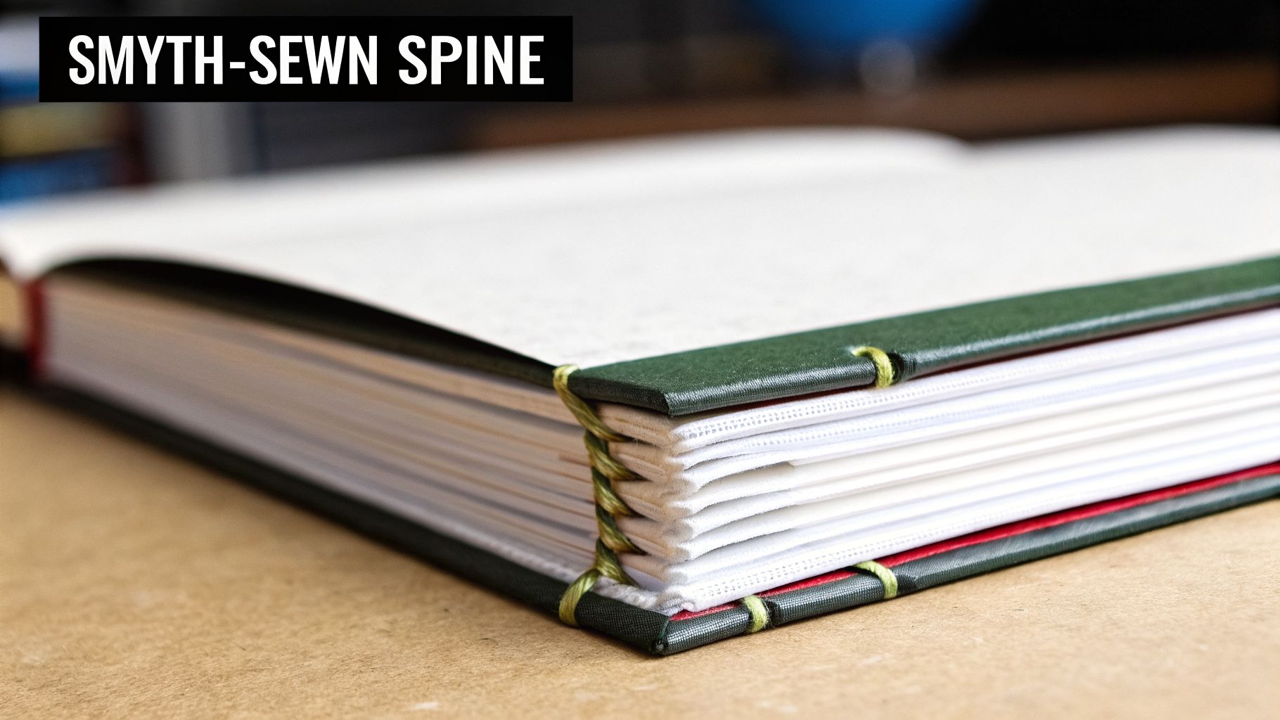
Smyth-Sewn Signatures: The Unbreakable Core
The heart of any truly durable book lies in how its pages are bound. The industry gold standard for library binding is Smyth-sewn signatures.
The process involves folding pages into small booklets (signatures), which are then physically sewn together with thread. This creates a single, unified textblock that is both incredibly strong and highly flexible. Pages cannot be easily pulled out—a common failure point in adhesive-bound books. Critically, the book can lie almost completely flat without cracking the spine, a key feature for readability and longevity.
For a publisher, specifying Smyth-sewn construction is the single most important decision to ensure a book’s structural integrity for the institutional market.
Reinforced Hinges and Endpapers
The flexible joint where the cover meets the book block—the hinge—is a major stress point. In a standard hardcover, a simple paper endpaper is used, which is prone to tearing after repeated openings. A single forceful tug can cause the textblock to separate from its cover.
Library binding addresses this vulnerability with a more robust engineering approach.
Reinforced endpapers, typically featuring a sturdy cloth strip made of cambric, create an exceptionally strong and flexible hinge. This reinforcement acts like a ligament, absorbing the strain of thousands of openings and keeping the cover firmly attached for the life of the book.
While it may seem like a minor detail, it is a key indicator of quality that librarians and procurement officers actively look for. It is a clear signal that the book was engineered for longevity. You can explore how different bindings, papers, and coatings work together to create a superior product.
Superior Cover and Spine Materials
A book’s cover is its first line of defense. Instead of standard paper-based materials, library editions are wrapped in high-strength cloths like buckram. This is a stiff, durable cotton cloth treated to resist moisture, scuffs, and tears, making it ideal for withstanding heavy institutional use.
The spine is constructed with equal rigor, often reinforced with multiple layers to prevent crushing or warping from repeated removal from tightly packed shelves. This robust structure protects the sewn pages within and maintains the book's integrity throughout its service life.
The economic payoff is significant. Industry data demonstrates that professionally produced library-bound books can reduce replacement frequency by up to 75%—a substantial cost saving for any institution.
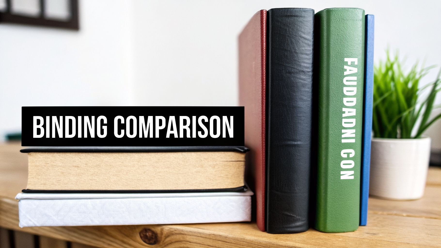
Comparing Library Binding with Case and Perfect Binding
For publishers, selecting the right binding is a strategic decision that dictates a book's market viability, lifespan, and profitability. It's a common misconception that a standard retail hardcover is merely a slightly less durable version of a library-bound book. While they may appear similar externally, they are engineered for entirely different ecosystems. The choice is not about "good" versus "bad" but about aligning the product with its intended market.
Perfect Binding: The Paperback Workhorse
Perfect binding is the engine of the mass market. In this method, pages are stacked, the spine is ground flat, and a strong, flexible adhesive holds the textblock together inside a paper cover.
Its primary advantages are speed and cost-efficiency, making it ideal for mass-market fiction, trade paperbacks, and any title where a low consumer price point is critical. The trade-off is durability; the adhesive-only construction is susceptible to cracked spines and loose pages under heavy use.
Case Binding: The Classic Retail Hardcover
Case binding is the standard for what is commonly known as a "hardcover." The book’s pages are either glued or, for more premium editions, Smyth-sewn into a textblock. This block is then attached to a rigid cover (the "case") using endpapers.
This represents a significant step up in quality from a paperback, providing a durable, high-value feel appropriate for new releases, special editions, and personal collections. However, while built to last in a home environment, it lacks the structural reinforcement required for the relentless demands of institutional use.
At its core, the difference is strategic. Case binding is for the consumer market, creating an aesthetic object for a personal library. Library binding is for the institutional market, engineered from the ground up as a durable asset for a shared collection.
Library Binding: Engineered to Endure
Library binding is not a style; it is a stringent manufacturing specification. It combines the strongest structural elements—like Smyth-sewn pages that lay flat—with heavy-duty components such as reinforced hinges and robust buckram cloth covers. Every component is selected with a single goal: to survive in a high-circulation environment.
This is the gold standard for publishers selling into schools, universities, and public libraries. While the upfront unit cost is higher, the investment delivers a superior return. A library-bound book can easily withstand 100+ circulations, making it a far more economical purchase for institutions over the long term. This choice demonstrates an understanding of your clients' operational needs and a commitment to providing lasting value.
To see how these three methods compare from a strategic publishing perspective, review this breakdown. It clarifies where each binding delivers maximum value.
Binding Method Comparison for Publishers
Attribute
Library Binding
Case Binding (Trade Hardcover)
Perfect Binding (Paperback)
Page Attachment
Smyth-sewn signatures for maximum strength and lay-flat capability.
Often glued (adhesive bound), sometimes Smyth-sewn for "special editions."
Adhesive bound (glued) spine only.
Durability
Highest; designed to withstand 100+ circulations.
Medium; suitable for personal use but vulnerable in high-use settings.
Lowest; prone to spine cracking and page loss with repeated use.
Cover Material
Heavy-duty buckram cloth over rigid binder's board.
Paper or cloth over binder's board.
Flexible cardstock, often with a laminate finish.
Hinge Strength
Reinforced with cloth for exceptional tear resistance.
Standard paper endpapers create a weaker hinge.
The cover itself acts as the hinge, a common point of failure.
Ideal Market
Public libraries, K-12 schools, university presses, and reference collections.
Consumer retail bookstores, book clubs, and gift markets.
Mass-market retail, airport bookstores, and high-volume/low-cost titles.
Cost Profile
Highest upfront unit cost, but lowest total cost of ownership for institutions.
Moderate upfront cost with a strong perceived value in retail.
Lowest upfront unit cost, enabling accessible consumer pricing.
Ultimately, aligning your binding choice with your market strategy from the outset ensures your book is built to succeed, whether it's destined for a quiet personal library or the demanding hands of a hundred readers.
Meeting Durability Standards for North American Markets
Securing placement in North American library collections requires more than a compelling title; it demands a product engineered to withstand the rigorous, high-circulation environment. While formal benchmarks like the ANSI/NISO/LBI standards exist, what procurement officers across the United States and Canada truly seek is tangible proof that a book is built to last.
For publishers, this isn't about memorizing complex regulations. It's about integrating key production specifications into the manufacturing process from the start. Getting this right ensures your titles not only gain acceptance but also build your reputation and secure long-term institutional sales.
The Tangible Specifications That Matter
Beyond foundational elements like Smyth-sewing, several other details signal to a librarian that your book is a sound investment. A knowledgeable printing partner understands these specifications intimately, helping transform a standard book file into a genuinely library-ready product.
Key details that make a significant difference include:
Generous Margin Space: Library books are often rebound during their lifecycle. Planning for this is essential. Providing at least one inch of gutter margin (the inside margin) is critical to ensure no text is lost during repair or rebinding.
Correct Paper Grain Direction: Paper has a grain, and its direction matters. Ensuring the grain runs parallel to the spine is a non-negotiable detail. This prevents pages from warping or resisting the binding, helping the book lie flat and resist damage over years of use.
Archival-Quality Materials: Libraries are, by definition, archives. The use of acid-free paper is an absolute requirement. It prevents pages from yellowing and becoming brittle, ensuring the book remains a valuable part of a collection for decades.
When a publisher invests in these specifications, it sends a clear message to institutional buyers. It demonstrates an understanding not just of bookmaking, but of creating a lasting asset for their community.
Durability Is Your Best Sales Pitch
In the North American library sector, print books remain circulation workhorses. A simple fact drives purchasing decisions: library-bound editions can last 5 to 10 times longer than a typical trade edition. For budget-conscious schools and universities, that longevity translates to a lower total cost of ownership—a powerful sales proposition.
This durability also integrates seamlessly with modern logistics for automatic stock replenishment, keeping high-demand titles consistently available. By collaborating with a printer who understands these requirements, you can easily build these specifications into your production workflow.
Marquis offers a comprehensive North American book printing platform designed to handle these exact specifications, helping publishers produce books that meet and exceed institutional expectations.
Ultimately, building books to these durability standards is a strategic imperative. It mitigates the risk of rejection by distributors and libraries, strengthens your brand's reputation for quality, and positions your titles for a long and profitable life in a competitive market. It demonstrates that you are a publisher who builds books not just to be read, but to endure.
Understanding the technical aspects of binding is one thing; applying that knowledge to a publishing program is where strategic advantage is created. Making the right binding choice can determine a title's success, ensuring the physical product is perfectly aligned with its intended audience and lifecycle. To achieve this, publishers often apply principles of product management for media publishers, which connects editorial decisions with overarching business goals.
Let's examine this through real-world publishing scenarios. The optimal choice for a dense academic text is almost never the right fit for a colorful children’s picture book, even if both are destined for library shelves. Each book has a unique purpose and faces distinct physical demands.
Scenario 1: The University Press Textbook
For a university press publishing a core textbook, durability is not a feature; it's a fundamental requirement. These books are significant investments for students and university libraries, expected to withstand years of heavy use, highlighting, and transport. A standard case binding is simply insufficient.
In this context, library binding with Smyth-sewn signatures is the only viable option. This robust construction allows the book to lie flat on a desk for study without the spine cracking or pages coming loose. It’s how a publisher guarantees their investment results in a product that meets the high standards of the academic market, justifying its premium price and securing its place on course adoption lists for years to come.
Scenario 2: The Trade Children’s Book Series
Consider a trade publisher with a best-selling series of picture books. These titles are staples of public library story times, handled daily by countless children. They are dropped, exposed to spills, and loved with an enthusiasm that can destroy a poorly made book in weeks.
For these high-traffic titles, a reinforced binding is non-negotiable. While a full, heavy-duty buckram library binding might be excessive, a durable case laminate with Smyth-sewn pages and reinforced hinges strikes the perfect balance between strength and visual appeal. It keeps the book vibrant and intact, ready for the next reader, circulation after circulation.
Library data consistently shows that physical books are still in high demand, with children's literature leading the charge. This is precisely why publishers serving these markets need a range of binding options—from simple perfect binding for paperbacks to Smyth-sewn case laminates for library editions. With readers still deeply engaged with print, libraries need books built to last. You can learn more about these public library circulation findings and what they mean for publishers.
Scenario 3: The High-Circulation Graphic Novel
Graphic novels present a unique challenge. The art is the narrative, meaning the book must lie as flat as possible to deliver the intended reading experience. In libraries, where graphic novels are immensely popular and see constant use, a binding that resists opening leads to a broken spine and a frustrated patron.
For this market, a Smyth-sewn binding is non-negotiable. This method is key to allowing the book to open fully and lie flat, preserving the integrity of the artist's two-page spreads without stressing the spine. Paired with a durable cover, this creates a book that both honors the art form and is tough enough for the library circuit. It is a perfect example of how the right binding is a critical component of the reader's experience.
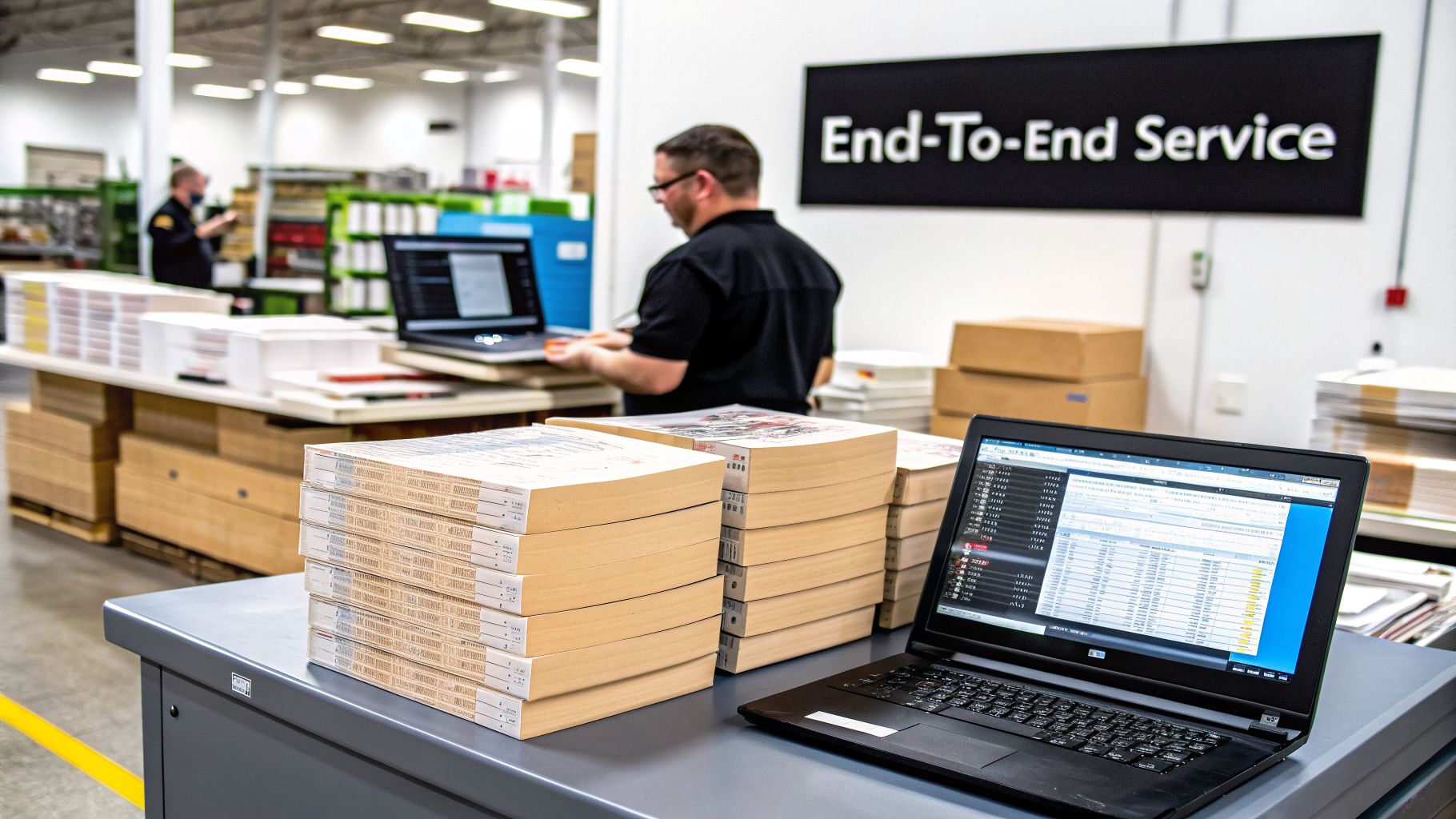
Partnering for End-to-End Production and Distribution
Understanding the technical specifications of library binding is one part of the equation. Transforming that knowledge into a finished book delivered to libraries across the continent is a complex logistical challenge. It requires a production partner capable of executing every step flawlessly.
For publishers, the ultimate goal isn't just creating a durable book; it's efficiently managing its entire lifecycle, from print run to end-user. This is where an integrated manufacturing and logistics partner becomes a decisive competitive advantage, offering a single-source solution to a fragmented supply chain.
From Pre-Press to North American Distribution
A true production partnership begins long before the presses run. It starts with a team that understands the specific demands of library binding books. This includes critical pre-press checks—like verifying margins are sufficient for sewing and potential rebinding, or ensuring paper grain is correctly oriented for maximum durability.
This integrated approach provides a single point of contact and accountability for the entire production ecosystem:
The Right Printing for Any Job: Whether you need a short, on-demand run or a massive offset printing, you get access to the right technology. Digital, offset, and high-speed inkjet presses ensure every project is high-quality and cost-effective.
Smart Inventory and Replenishment: Move beyond guesswork. Modern systems can track stock levels and automatically trigger new print runs when inventory is low, keeping key titles available without tying up capital.
Seamless Logistics: A partner with a robust North American footprint can manage warehousing and distribution across the United States and Canada, simplifying access to both English and French-speaking markets.
For a publisher, this unified model transforms a complex series of tasks into a single, streamlined workflow. It reduces administrative overhead, minimizes the risk of costly errors, and accelerates speed-to-market.
A Gateway to the Entire Market
By centralizing production and logistics, publishers can achieve significant gains in profitability. Consolidating manufacturing, inventory management, and distribution with one expert partner eliminates the friction—and hidden costs—of juggling multiple vendors.
This model frees you to focus on your core competency: creating and curating exceptional content. You can trust your partner to manage the complexities of producing books to the highest durability standards and distributing them efficiently.
Ultimately, this kind of partnership serves as a strategic gateway to the entire North American and even European institutional markets. It’s about more than just printing a book; it’s about leveraging a full-service manufacturing and supply chain solution built to support your long-term success.
Frequently Asked Questions About Library Binding
We receive many inquiries from publishers evaluating whether library binding is the right strategic fit for their titles. To provide clarity, here are concise answers to the most common questions, based on our extensive experience producing these ultra-durable editions for the North American market.
Is Library Binding More Expensive Than a Standard Hardcover?
Yes, the upfront unit cost for a library-bound book is higher. This reflects the use of premium materials and more labor-intensive construction processes, such as Smyth-sewing the page signatures. However, the key metric for the institutional market is the total cost of ownership.
A library-bound book can last up to 10 times longer than a standard trade hardcover. For a librarian managing a constrained budget, this longevity is a compelling value proposition. It translates to fewer replacements, reduced repair costs, and greater value from every dollar allocated. Offering this format positions your titles as a smart, long-term investment for their collections.
Can I Order Short Runs of Library Bound Books?
Yes, absolutely. The era of requiring massive offset runs for specialized bindings is over. Modern digital printing and print-on-demand technologies make short runs of library-bound editions both practical and cost-effective.
This capability is a strategic advantage for publishers. It allows you to test a new title in the institutional market without significant capital investment in inventory.
It is also the ideal solution for fulfilling specific purchase orders from library distributors or for reissuing popular backlist titles as demand arises. Our on-demand platforms are engineered to simplify the management of these specialized, high-value print runs.
Do I Need to Prepare My Files Differently?
Yes, and this is one of the most critical steps in the production process. The most important specification to address is the inside margin, also known as the gutter. This is the blank space where the pages meet at the spine.
Because library binding involves sewing physically through the folded page signatures, any text or images positioned too close to the center will be pulled into the binding and become unreadable. We always recommend a gutter of at least 1 inch (25.4 mm) to ensure nothing is lost and that the book can open wide for optimal readability.
You are not alone in this process. Our expert pre-press team works directly with every publisher to review files and ensure they are optimized for a perfect, durable final product.
At Marquis, we are more than just a printer; we are your integrated partner for producing and distributing high-quality books across North America and Europe. From specialized library binding to streamlined logistics, we provide the end-to-end solutions publishers need to succeed in a global market.
In a competitive North American market, a binder's cover is more than a protective layer; it's a strategic asset. For small and medium-sized publishers, the right cover design, material choice, and finishing technique can differentiate an educational series, elevate a corporate manual, or signal premium quality for a specialty release. Moving beyond generic templates, publishers must use production capabilities to create covers that resonate with specific markets, from institutional buyers in the U.S. to trade channels across North America and Europe.
A well-executed binder cover acts as the first point of contact with your audience, immediately communicating the value and professionalism of the contents within. It must do more than simply look good; it must function as a core part of your brand strategy. To truly stand out, it's crucial to understand the principles behind how to design a cover that sells, ensuring your binder grabs attention immediately. This is particularly important for educational materials and professional training resources where perceived authority is key.
This roundup explores eight professional binder cover ideas, detailing the technical specifications, material choices, and integrated production solutions that transform a simple concept into a powerful market statement. Each idea is tailored for the modern publisher, focusing on how to align design with production efficiency, brand positioning, and supply chain strategy for maximum impact across both English and French markets. You will find actionable guidance on everything from eco-friendly stocks and premium foils to variable data printing, providing a clear path from concept to a finished product that reinforces your brand's standing.
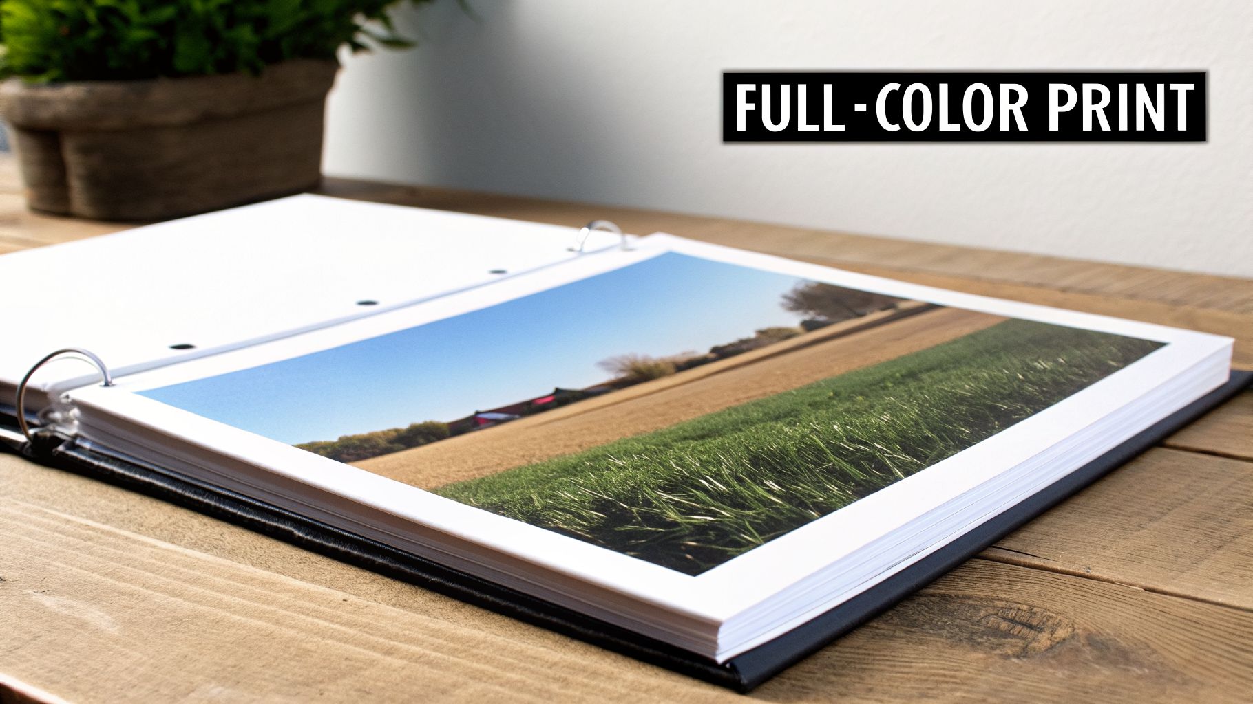
1. Custom Full-Colour Digital Print Covers
High-resolution digital printing offers a direct path for publishers to produce vibrant, full-colour binder covers with photographic precision. This method uses modern digital press technology to reproduce complex designs and detailed imagery without the setup costs associated with traditional offset printing. For publishers requiring professional-grade aesthetics across variable or smaller print runs, this approach provides a cost-effective and flexible solution.
Ideal Use-Cases
The strength of digital printing lies in its adaptability, making it a prime choice for projects where visual impact is critical, even at lower volumes. This technique is one of the most effective binder cover ideas for creating a strong market presence. Consider it for:
Educational Materials: University presses can create visually engaging workbooks and course packs with custom branding for specific departments or programs. The ability to print on-demand aligns perfectly with fluctuating student enrolment numbers.
Corporate Training Manuals: Companies can produce high-quality, branded training binders that reinforce corporate identity. Digital printing allows for easy updates to content and logos as the organization grows.
Specialized Publishing: Publishers producing niche or specialty series can maintain a consistent, professional look across all titles while benefiting from the economic feasibility of smaller, targeted print runs.
Production and Technical Specifications
To achieve the best results, careful file preparation is essential. Collaborating with a print partner that has deep experience in digital production, such as Marquis, ensures that the final product matches the design intent.
Key Insight: The primary advantage of digital printing for binders is the elimination of plates and lengthy setup times. This makes it economically viable to test a cover design with a small batch before committing to a larger North American or European distribution.
File Preparation Checklist:
Colour Space: Always submit design files in CMYK (Cyan, Magenta, Yellow, Key/Black). Files submitted in RGB must be converted, which can cause unexpected colour shifts.
Bleed Margins: Incorporate a 0.25-inch (6.35 mm) bleed on all sides of the artwork. This ensures your design extends to the very edge of the cover after trimming, preventing any unsightly white borders.
Resolution: For all images and graphics, use a minimum resolution of 300 DPI (dots per inch) to guarantee sharp, clear output.
Protective Finishes: Request a matte or gloss coating to protect the print from scuffing and handling, extending the binder's lifespan. Matte finishes offer a subtle, sophisticated feel, while gloss makes colours pop.
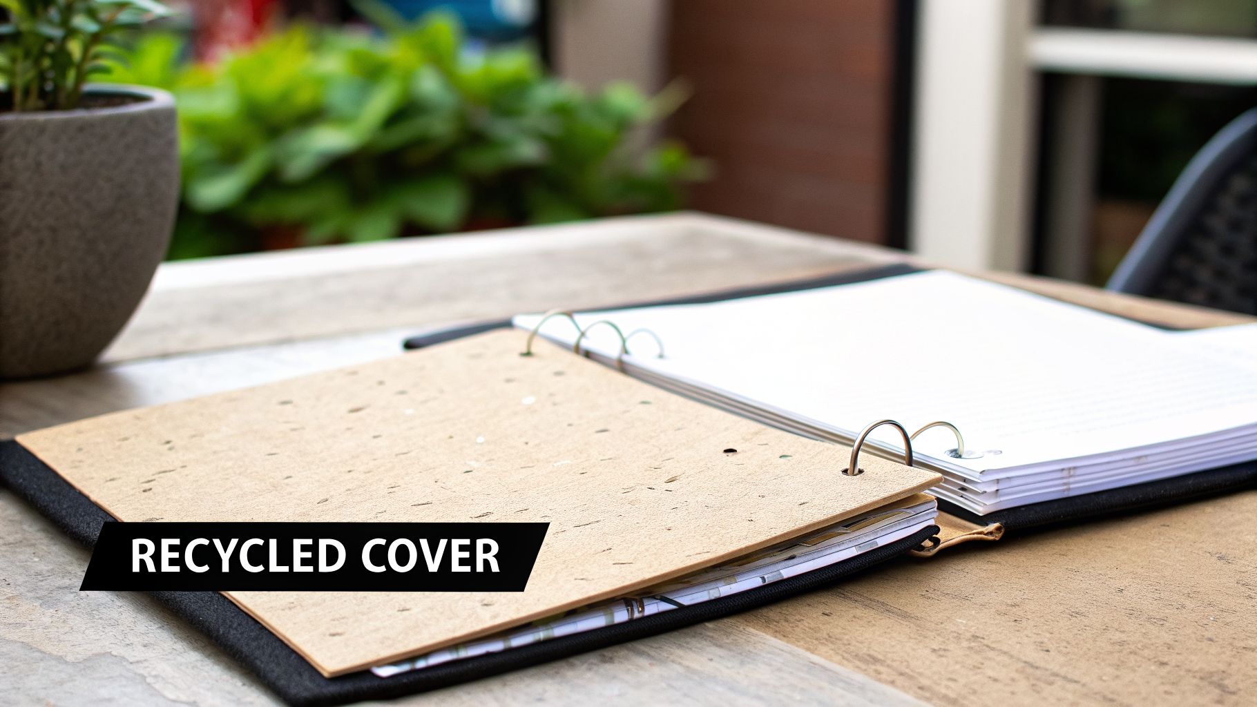
2. Eco-Friendly Recycled Paper Covers
Sustainable binder covers crafted from post-consumer recycled paper or FSC-certified materials are an excellent choice for publishers and educational institutions aiming to reduce their environmental impact. This approach visibly demonstrates corporate responsibility while delivering a professional, durable product that resonates with an eco-conscious audience. It's a binder cover idea that aligns brand values with tangible action.
Ideal Use-Cases
Recycled paper covers are particularly effective for projects where the publisher's message is tied to sustainability, education, or social responsibility. This choice reinforces the content's integrity and appeals to specific market segments. Consider it for:
Corporate Sustainability Reports: Presenting an annual environmental or social governance report in a binder made from recycled materials sends a powerful, consistent message of commitment.
University Press Materials: Course packs for environmental science, sociology, or public policy programs benefit from a cover that reflects the subject matter's core principles.
Non-Profit and NGO Documents: Organizations focused on conservation, advocacy, and community outreach can use recycled binders for their training manuals, annual reports, and member kits to align with their mission.
Environmental Science Textbooks: Publishers can underscore the educational content by choosing a production method that practices the principles taught within the book.
Production and Technical Specifications
Achieving a high-quality result with recycled materials requires attention to specific production details. Partnering with a printer knowledgeable in sustainable options ensures the final product is both beautiful and certifiably green. For an overview of material choices, explore Marquis's range of bindings, papers, and coatings.
Key Insight: Clearly displaying certification logos (like FSC or recycled symbols) on the binder's back cover or inside flap validates your environmental claims. This small detail adds significant credibility and informs the end-user of your commitment to responsible sourcing.
File Preparation Checklist:
Ink Selection: Request vegetable-based or soy-based inks to complement the recycled paper and further minimize the product's environmental footprint.
Colour Palette: Design with earth tones and natural colour schemes. These palettes work harmoniously with the subtle texture and unique character of recycled paper stock.
Supplier Verification: Work with your print partner to source materials from certified suppliers to ensure all environmental claims are verifiable and authentic.
Protective Finishes: Even eco-friendly binders need protection. Opt for a water-based aqueous coating for a protective layer that is more environmentally friendly than many traditional varnishes.
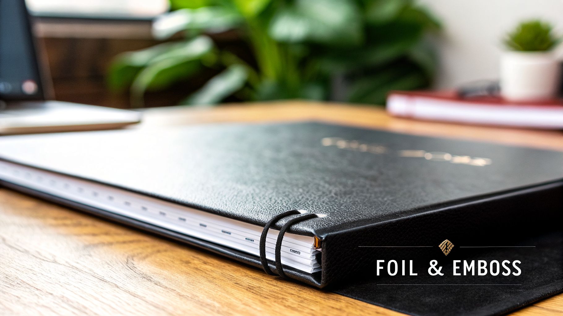
3. Foil-Stamped and Embossed Premium Covers
Combining foil stamping with embossing introduces a tactile dimension and visual elegance to binder covers. These finishing processes physically alter the cover's surface; foil stamping applies a metallic or pigmented foil using heat and pressure, while embossing creates a raised design. This pairing produces a premium look and feel that elevates a binder's perceived value, making it a powerful tool for publishers aiming to capture attention in high-value market segments.
Ideal Use-Cases
The luxurious effect of foil and embossing makes this one of the most distinguished binder cover ideas for projects where a sense of exclusivity and quality is paramount. It is an excellent choice for creating a lasting impression that resonates with discerning audiences. Consider it for:
Premium Graphic Novel and Manga Editions: Publishers can create sought-after collector’s editions or deluxe versions of popular series, where the tactile cover justifies a higher price point.
Limited Edition Luxury Collections: High-end trade and literary publishers use these finishes to signify a special release, often for classic works or author-signed collections that appeal to collectors.
Corporate Executive Documents: Organizations can present annual reports, major proposals, or executive summaries in binders that project authority and meticulous attention to detail.
High-End Trade Fiction: For a lead title or a breakout author, a foil-stamped cover can distinguish the book on crowded retail shelves and signal its importance to booksellers and readers.
Production and Technical Specifications
Success with foil and embossing requires precise design and close collaboration with a print partner. The physical nature of these processes demands that artwork is prepared with specific mechanical tolerances in mind to avoid errors.
Key Insight: The combination of foil and embossing adds both visual and physical weight to a design. This multi-sensory experience is highly effective for establishing a product as a premium offering, creating a memorable object that consumers are more likely to keep and display.
File Preparation Checklist:
Vector Artwork for Dies: All foil and emboss elements must be submitted as vector files (e.g., .ai or .eps). This is non-negotiable, as physical dies are created from these files.
Minimum Line Thickness: Ensure all lines and text to be foiled have a minimum width of 0.5 points. Thinner lines may not transfer cleanly, resulting in broken or incomplete foil application.
Foil and Emboss Registration: If foil and emboss are applied to the same area (a "foil emboss"), provide a single vector file. If they are separate design elements, provide each on its own layer or in a separate file for accurate registration.
Substrate Selection: Combine these finishes with premium, heavy-weight paper stocks and durable cover materials. The sturdiness of the substrate supports the die pressure and enhances the overall luxurious feel. For more information on what's possible, explore our full range of specialty finishes and embellishments.
4. Laminated Matte and Gloss Protective Finishes
Protective lamination is a finishing process that seals a printed binder cover with a thin, transparent film, offering significant durability and visual enhancement. This process protects the underlying print from moisture, scuffs, fingerprints, and general wear. Publishers can select between matte or gloss finishes, each providing distinct aesthetic and functional qualities to suit different market expectations and product positionings.
Ideal Use-Cases
Lamination is not just about protection; it is a strategic choice that communicates a product's intended quality and use. It stands as one of the most practical binder cover ideas for extending the life and appeal of frequently handled materials. Consider it for:
Educational Publishing: Major publishers rely on lamination to ensure their workbooks and texts withstand a full academic year of use by students. A matte finish is often preferred for its glare-free readability.
Medical and Pharmaceutical Documentation: In clinical or laboratory settings, binders must resist spills and constant handling. A gloss lamination provides a wipeable, non-porous surface that is easy to keep clean.
Corporate and Institutional Training: Binders used for training materials benefit from the professional appearance and resilience of a matte lamination, which resists fingerprints during repeated use in professional environments.
Trade Publishing: For consumer-facing trade books, a gloss finish can make cover colours appear more saturated and vibrant, helping the title stand out on a crowded retail shelf.
Production and Technical Specifications
The choice between matte and gloss is a critical decision that influences both perception and performance. Partnering with a print expert ensures the selected finish aligns with the paper stock and overall design goals for your project.
Key Insight: The tactile experience of a binder cover can be as important as its visual design. A soft-touch matte lamination conveys a premium, modern feel, while a high-gloss finish creates a perception of energy and high value, making it ideal for grabbing consumer attention.
File Preparation Checklist:
Finish Selection: Choose matte lamination for a sophisticated, non-reflective surface ideal for professional or academic content. Opt for gloss lamination to make colours pop and create a high-impact visual for retail markets.
Thickness Specification: Specify the lamination thickness, typically between 1.3 mil and 3.0 mil. Thicker films offer greater rigidity and protection, which is ideal for heavy-use binders.
Colour Testing: Always request a finished sample proof. Lamination can slightly alter the appearance of printed colours, and testing ensures the final product meets your brand standards before a full production run.
Combining with Other Finishes: For a luxury effect, consider pairing a matte lamination with a spot UV gloss or foil stamping to create a compelling contrast in texture and sheen.
5. Textured and Specialty Paper Stock Covers
Moving beyond standard gloss or matte finishes, printing on specialty papers with unique textures, finishes, and material compositions creates a distinctive tactile experience. Options like linen, felt, canvas, or classic kraft paper provide a binder cover with character and depth, signaling premium quality before the reader even opens the first page. This approach turns the cover into a sensory element that supports the book's overall theme and artistic positioning.
Ideal Use-Cases
The choice of a textured stock is a deliberate one, meant to connect with a specific audience or reflect the nature of the content. This is one of the most effective binder cover ideas for publishers aiming to create an artisanal or high-end product feel. Consider this method for:
Literary and Art-Focused Publications: Mid-sized and specialty presses publishing poetry collections or literary fiction can use textured paper to give their titles a tangible, memorable quality that stands out on shelves.
Boutique Publisher Releases: For limited-edition runs or special collections, a specialty stock reinforces exclusivity and justifies a premium price point, appealing to collectors and connoisseurs.
Art and Coffee Table Books: A canvas or linen-textured cover can echo the artistic medium of the content within, creating a cohesive and immersive experience for the reader.
Production and Technical Specifications
Working with specialty papers requires close collaboration with your print partner to ensure the final product aligns with your creative vision. The paper's properties, including its absorbency, colour, and texture, directly influence how ink appears, making expert guidance essential.
Key Insight: Textured stocks do more than add visual appeal; they change how a reader physically interacts with a book. Requesting paper samples is not just a recommendation but a critical step to feel the weight and texture, ensuring it complements the design and content quality.
File Preparation Checklist:
Colour and Proofing: Always request a hard-copy proof on the exact paper stock you intend to use. Colours can appear more subdued or shift on textured and non-white papers.
Design Considerations: Pair the texture with a suitable design. A minimalist design with debossing or foil stamping often works better on heavily textured stock than a full-colour photograph.
Paper Weight: Select a paper weight (measured in gsm or points) that feels substantial and durable. A thicker stock prevents curling and communicates the quality of the publication.
Sourcing Time: Specialty papers may require longer lead times for sourcing. Factor this into your production schedule to avoid delays in your distribution timeline.
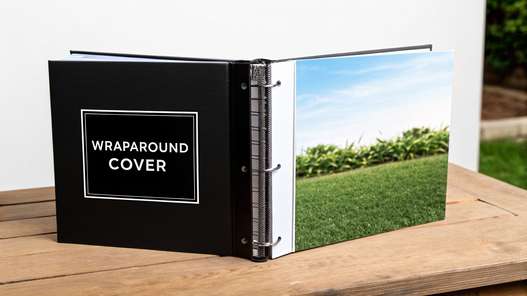
6. Wraparound and Full-Bleed Illustrated Designs
Wraparound covers, featuring illustrations that extend seamlessly across the front, spine, and back, create an immersive and continuous visual narrative. This approach maximizes the binder's entire surface area, transforming it into a single canvas for artistic expression. For publishers producing visually-driven content, this is one of the most effective binder cover ideas for establishing a cohesive and impactful design statement.
Ideal Use-Cases
The strength of a full-bleed wraparound design is its ability to tell a story before the binder is even opened. It is exceptionally well-suited for projects where the cover art is as important as the content inside. It is a popular choice for:
Graphic Novels and Manga: Publishers frequently use this technique to present dynamic character art and key scenes that entice readers and create collectible editions.
Children’s Picture Books: A continuous illustration across the entire binder can capture a child's imagination, depicting a playful scene or expansive world that invites them into the story.
Art and Photography Collections: For limited edition catalogues or artist portfolios, a wraparound cover can feature a signature piece, giving the entire publication a premium, gallery-quality feel.
Literary Box Sets: When packaging a series, a single panoramic illustration that spans multiple binder spines creates a stunning visual display on a bookshelf, encouraging readers to collect the entire set.
Production and Technical Specifications
Executing a flawless wraparound cover demands precision in both design and production. Close collaboration with your print partner is essential to manage the technical complexities and ensure the final product is seamless. Excellent graphic design and layout are critical to the success of these ambitious covers.
Key Insight: The most critical technical detail for a wraparound cover is the spine width calculation. An inaccurate measurement can cause the design to shift, misaligning key visual elements and disrupting the continuous artwork. Always confirm final spine dimensions with your printer based on the final page count and paper stock.
File Preparation Checklist:
Unified Artwork: Submit the entire cover (front, back, and spine) as a single, continuous artboard. Do not provide separate files.
Spine Gutter Awareness: Keep critical text and focal points of the illustration at least 0.25 inches (6.35 mm) away from the spine folds (gutters) to prevent distortion or awkward wrapping.
Bleed Requirements: A 0.25-inch (6.35 mm) bleed must be added to all four outer edges of the flat cover layout to ensure the artwork extends to the edge after trimming.
High-Resolution Imagery: Ensure all raster artwork maintains a minimum of 300 DPI at its final print size to avoid pixelation, especially on large-format illustrations.
Request Mockups: Ask your print partner for a 3D digital or physical mockup to verify the alignment and placement of your design before committing to the full production run.
7. Interactive and Die-Cut Cover Elements
Die-cutting introduces a tactile and visual dimension to binder covers, creating an engaging experience that goes beyond a standard flat surface. This process uses a custom-made steel die to cut specific shapes, windows, or patterns into the cover material. The result is a memorable product that invites physical interaction, making the binder itself an object of interest and a statement of creative quality.
Ideal Use-Cases
The unique appeal of die-cutting makes it one of the most effective binder cover ideas for projects where grabbing attention and creating a premium feel is paramount. It is especially suited for niche markets and special editions where design plays a central role in value perception. Consider this technique for:
Children’s Educational Binders: Shaped covers or peek-through windows can make learning materials more exciting for young readers, encouraging them to open the binder and explore the content.
Holiday and Gift Sets: A binder with a festive die-cut, like a snowflake or tree, can serve as premium packaging for gift books or special course materials offered during the holidays.
Limited Collector's Editions: For publishers releasing a collector's version of a work, a custom die-cut cover adds significant perceived value and justifies a higher price point.
Premium Corporate Packages: High-end training binders or new-hire kits with a die-cut logo make a strong first impression and reinforce brand prestige.
Production and Technical Specifications
Successful die-cut projects depend on close collaboration between the design and production teams to ensure the final product is both beautiful and structurally sound. Working with an experienced print partner like Marquis from the initial concept phase is critical to navigating the technical requirements.
Key Insight: While die-cutting involves an initial tooling cost, this investment is justified by the distinct market advantage it creates. For publishers looking to produce a standout product, the cost is balanced by the potential for increased sales and brand recognition.
File Preparation Checklist:
Die-Line File: Provide a separate vector file (e.g., from Adobe Illustrator) with the cut path clearly marked as a spot colour named "Die-Line." This tells the machinery exactly where to cut.
Structural Integrity: Ensure there is enough material surrounding the die-cut areas to prevent tearing. A minimum of 0.25 inches (6.35 mm) of solid board around intricate cuts is recommended.
Binding Compatibility: Confirm that the placement of your die-cut will not interfere with the binder's rings or spine mechanism.
Stock Selection: Choose a durable, high-quality paper stock or board that can withstand the die-cutting process without fraying or weakening. Heavier stocks are generally preferred.
Proofing: Always request a physical proof to test the die-cut's accuracy and the overall structural stability before committing to the full production run.
8. Variable Data and Personalized Custom Covers
Variable Data Printing (VDP) moves beyond one-size-fits-all production by allowing unique information on each binder cover within a single print run. This technology directly integrates database information into a design template, personalizing elements like names, identification numbers, or location-specific details. For institutional, corporate, and educational publishers, this offers an efficient way to create customized materials at scale without the setup costs of traditional methods.
Ideal Use-Cases
VDP is most effective when content needs to be specifically targeted to an individual recipient, department, or event. The ability to customize each unit adds a layer of professionalism and relevance that static covers cannot match, making it an excellent addition to any collection of binder cover ideas. Key applications include:
Corporate Training Materials: Companies can print binders with each employee’s name, department, and training group, creating a personalized experience and simplifying distribution.
University Course Packs: Educational publishers can produce materials customized with student names, course codes, or campus information, improving organization for large-scale programs.
Personalized Professional Development: Workbooks for seminars or workshops can be tailored with attendee names and credentials, enhancing the value of the event.
Institutional Documents: Administrative or financial reports can be printed with specific dates, department codes, or recipient details for precise record-keeping.
Production and Technical Specifications
Successful execution of a VDP project depends on meticulous data management and close collaboration with your print partner. Working with an experienced provider like Marquis ensures the technical aspects of data integration are handled correctly from the start.
Key Insight: The main benefit of VDP is mass customization. It allows for a high degree of personalization across a large print run, giving each recipient a unique product while maintaining brand consistency and production efficiency.
File and Data Preparation Checklist:
Database Hygiene: Provide a clean, accurate database (e.g., .csv, .xlsx) with clearly labelled columns for all variable fields. Data validation is critical to avoid errors.
Design File Markers: Use clear placeholders (e.g., <<FirstName>>, <<Department>>) in your design file to indicate where variable data should be inserted.
Proofing Process: Always request and review a set of proofs that demonstrates how the variable data will appear on the final product. Test the longest and shortest data entries to check for text flow issues.
Colour Space: Submit design files in CMYK to prevent unexpected colour shifts during production.
Safe Zones: Define ample safe zones around variable text fields to account for slight variations in text length and prevent content from being cut off.
Protective Finishes: Apply a matte or gloss coating to safeguard the printed surface from handling and wear, ensuring the longevity of these high-value custom binders.
8-Way Binder Cover Comparison
Item
Implementation complexity
Resource requirements
Expected outcomes
Ideal use cases
Key advantages
Custom Full-Color Digital Print Covers
Low–Moderate — digital press setup, color calibration
Digital press, CMYK files, short-run capacity, proofs
Photographic-quality full color, fast turnaround, variable options
Integrating Cover Strategy with Your North American Print Partner
The diverse binder cover ideas explored in this article, from eco-friendly recycled papers to intricate foil-stamped designs, demonstrate a fundamental principle: a cover is far more than a protective layer. It is a critical component of your product's market identity and a direct reflection of your brand's commitment to quality. The most effective concepts are born not from isolated design sessions but from a strategic, collaborative process that aligns creative vision with production reality. Mastering this alignment is what separates a standard binder from a memorable, high-value asset.
Success hinges on moving beyond a simple transactional relationship with a supplier. A true manufacturing partner offers guidance that connects your design aspirations with tangible outcomes. They can advise on how a particular textured stock will interact with a full-bleed illustration or whether a die-cut element is feasible within your project's budget and timeline. This integrated approach ensures your final product is not only visually compelling but also structurally sound and cost-effective.
From Concept to Finished Product: Key Takeaways
As you move forward, the central lesson is to view cover production as an extension of your publishing strategy. The choices you make have a direct impact on market perception, durability, and your overall return on investment.
Strategy Over Aesthetics: The best binder cover ideas are those that support a specific goal. A premium, foil-stamped cover might be perfect for a high-value corporate training kit, while a simple, durable laminated cover is better suited for high-volume educational materials. Always start with the "why" before settling on the "what."
Material and Finish Synergy: Your choice of paper, lamination, and specialty finishes should work in concert. A gloss laminate can make full-colour digital prints pop, while an uncoated, textured paper provides a tactile, sophisticated feel for an embossed logo. Discussing these combinations early with your print partner prevents costly mismatches.
Technical Precision is Non-Negotiable: Creative ambition must be paired with technical execution. Details like file preparation are critical. For instance, a deep dive into understanding the right resolution for print is essential to ensure your high-impact graphics and custom illustrations appear sharp and professional, not pixelated.
Key Insight: The difference between a good idea and a successful product lies in the execution. An experienced North American print partner provides the crucial bridge between your design files and a market-ready physical product, navigating the technical complexities on your behalf.
Your Next Steps to an Effective Cover Strategy
Armed with these binder cover ideas, your next action is to initiate a dialogue with your production team or print partner. Frame the conversation around the strategic insights discussed here. Instead of just requesting a quote for a "custom binder," present your vision by detailing the intended use case, target audience, and desired market positioning.
This approach transforms the conversation. It allows a partner like Marquis to provide solutions that go beyond a simple price list. We can recommend alternative materials that achieve a similar aesthetic at a lower cost, suggest finishing techniques that enhance durability for a specific environment, or configure a production run that optimizes logistics across English and French markets in North America. By treating your printer as a strategic consultant, you unlock a depth of manufacturing expertise that elevates your final product and strengthens your supply chain. The result is a binder cover that performs its function flawlessly and acts as a powerful ambassador for your brand.
Ready to transform your binder cover ideas from concept to reality? Marquis Book Printing provides an integrated, end-to-end production ecosystem for publishers across North America. Partner with us to align your creative vision with manufacturing excellence and produce materials that command attention in any market. Discover how Marquis can elevate your next project.
Marquis Book Printing’s senior management wanted to standardize daily management at its three manufacturing sites. Supervision requirements and problem-solving procedures are similar between the Montmagny, Louiseville and Toronto plants. Tervene was chosen as the tool for daily operations management.
Since 2019, Tervene’s digital tool has been helping supervisors and managers carry out their daily work at Marquis. The company has standardized multiple scheduled management responsibilities: audits, inspections, meetings andGemba walks. With Tervene, supervisors perform their tasks in collaboration with the support departments and senior management.
A management platform like Tervene eliminates the administrative burden and reduces the transcription associated with forms, planning meetings and compiling reports. According to Eric Bouchard, General Manager of Marquis, digital solutions help to speed up decision-making and resolve issues in the field.
Read thefull articleto learn how Marquis uses Tervene.
About tervene
Tervene is an all-in-one digital platform that helps manufacturers to standardize and simplify operational control, leader standard work, problem-solving, continuous improvement, and QEHS processes.
The first in a series of hardcover equipment installations is now completed, providing access to faster turnaround times and three times more production capacity.
And its only the beginning!
Get a 10% discount, up to $1000, on your first hardcover project with Marquis*!